How to design presentations that actually close deals


Why your presentation is your most overlooked sales tool
In many companies, sales teams treat their presentation deck as a necessary but secondary part of the pitch process. They spend weeks on strategy, pricing, and messaging—then throw the deck together the night before. The result? A missed opportunity to persuade, influence, and close.
A well-designed presentation or sales deck is more than a set of slides—it’s a direct driver of revenue. It frames your story, reinforces your value, and creates a lasting impression long after the meeting ends.
First impressions sell
The first 30 seconds of a presentation are critical. Prospects are making instant judgments about whether you’re credible, trustworthy, and worth listening to. And those judgments often come from what they see before they even process what they hear.
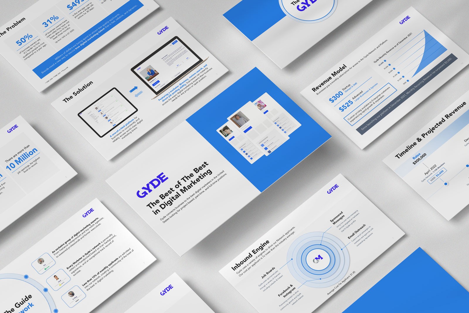
Your opening slide sets the tone. High-quality branding, thoughtful typography, and a clean layout signal that you’ve prepared—and that you care about details. That impression carries through the entire pitch.
Story over stats (but with the right stats)
Data alone rarely persuades. A winning pitch deck is built on a story—one that connects emotionally before backing it up with facts. Structure your presentation to guide prospects through a logical and emotional journey:
The problem: Define the challenge in a way your audience feels.
The opportunity: Show the gap in the market or missed potential.
Proof: Share relevant stats, case studies, or testimonials.
Your solution: Explain clearly and visually how you solve the problem.
ROI: Demonstrate measurable results or savings.
Call to action: Make the next step obvious and easy.
This approach blends persuasion with validation—making it easier for prospects to say “yes.”
Designing for decisions
Every slide in your sales deck should move the audience closer to making a decision. That means stripping away filler and focusing on the details that influence action:
Highlight pain points that matter to the prospect.
Visualize ROI with charts or infographics, not paragraphs of text.
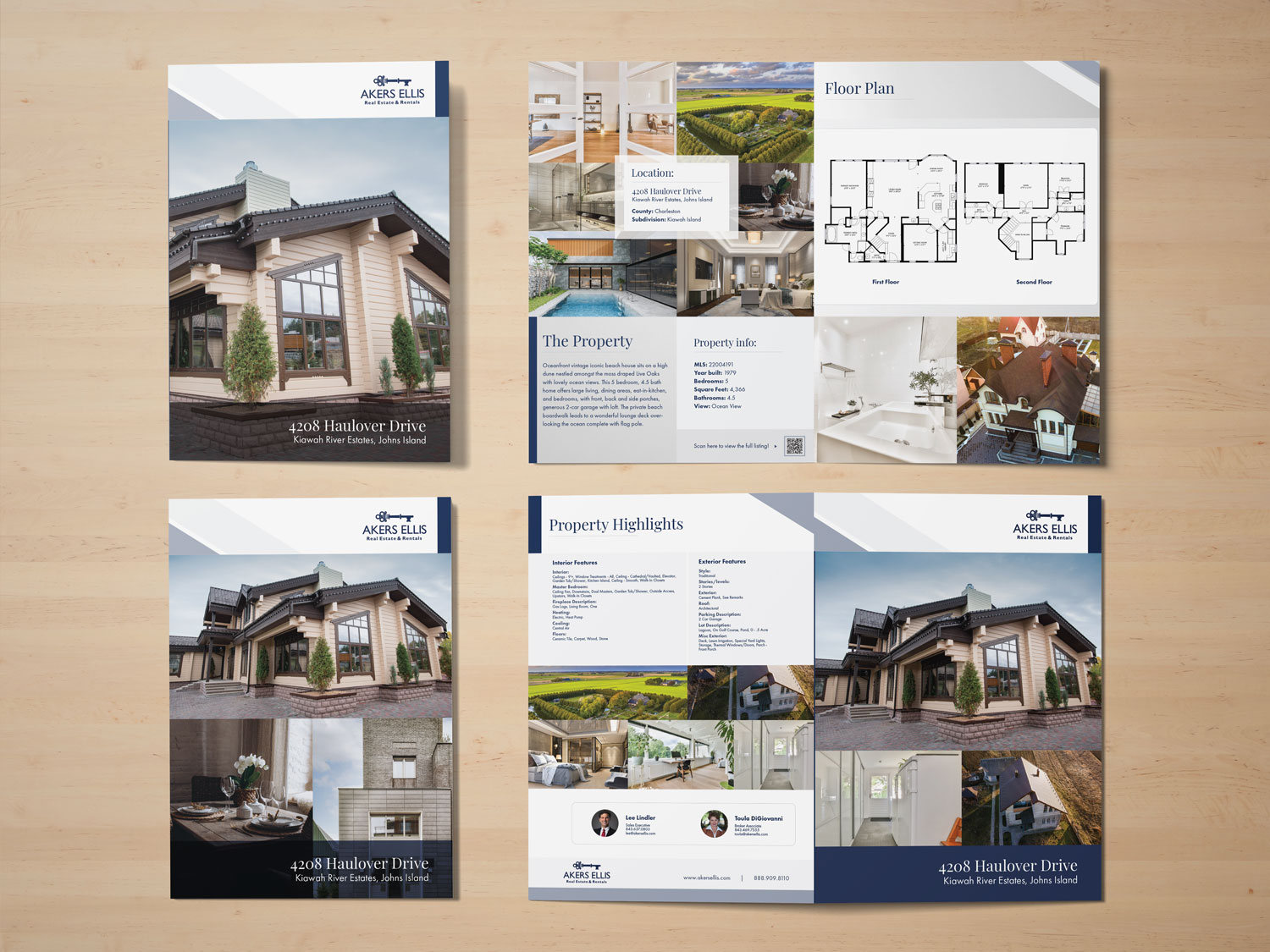
Use photography or imagery that feels authentic to your brand and audience.
By the time you reach the final slide, the design should have reinforced every point—not distracted from it.
Common sales deck killers (and how to fix them)
These are the design missteps that weaken even the strongest offers. The table below outlines what to watch for and how to address it:
Sales Deck Killer | Why It Hurts | How to Fix It |
|---|---|---|
Overloaded slides | Audience can’t focus on your key message. | Limit to one core point per slide and use whitespace strategically. |
Inconsistent branding | Makes you look unprepared or unprofessional. | Use a branded template with consistent colors, fonts, and spacing. |
Generic templates | Lack of uniqueness lowers perceived value. | Customize layouts to reflect your company’s identity and tone. |
No clear call to action | Leaves prospects unsure about next steps. | End with a bold, visible CTA slide that outlines exactly what to do next. |
Data dump charts | Overwhelms with numbers instead of insights. | Use clean, simple visuals to highlight the most important metrics. |
Brand it like your future depends on it
Your sales deck is a representation of your company’s value. Just like packaging influences how people perceive a product, design influences how people perceive your offer. High-end branding makes your offer feel high-end—regardless of price point.
Look at companies like Apple, Figma, and Stripe. Every touchpoint, from their websites to their presentations, feels premium. This consistency builds trust and makes prospects more confident in doing business with them.
It’s not about the tool—it’s about the expertise
Whether you use PowerPoint, Keynote, Google Slides, or Canva, what matters is how well the presentation is crafted. The tool doesn’t sell the deal—the design and delivery do.
At Xiobo Creative, we build branded, high-impact presentations in any platform your team prefers. That way, you get a sales deck that works for your workflow—and works for winning business.
The delivery matters as much as the design
A great design will get attention, but your delivery seals the deal. Rehearse transitions, timing, and the flow between slides so you’re not just reading content—you’re guiding a conversation.
The most effective presenters pair visual clarity with verbal confidence. The design is there to support you, not replace you.
Closing deals starts with closing the design gap
If your current sales deck looks “good enough,” it’s probably costing you opportunities. A strategic, professionally designed presentation positions you as a trusted partner—before you’ve even made the ask.
Investing in your deck isn’t about aesthetics—it’s about results. The right design can help you close more deals, shorten sales cycles, and strengthen relationships with every presentation.
A sales deck is one of the most powerful tools in your business arsenal—yet it’s often the most neglected. When designed with strategy, consistency, and clarity, it becomes more than a visual aid. It becomes a silent salesperson that works in your favor long after the meeting ends. At Xiobo Creative, we help teams transform their presentations into conversion tools that win business.
Stop sending “good enough” sales decks.
Let’s design a presentation that makes your prospects say “yes” before you finish talking.
Tags:
Related services

More about
Presentation design