The 6 presentation design trends that will elevate your brand in 2025

Why presentation design trends matter
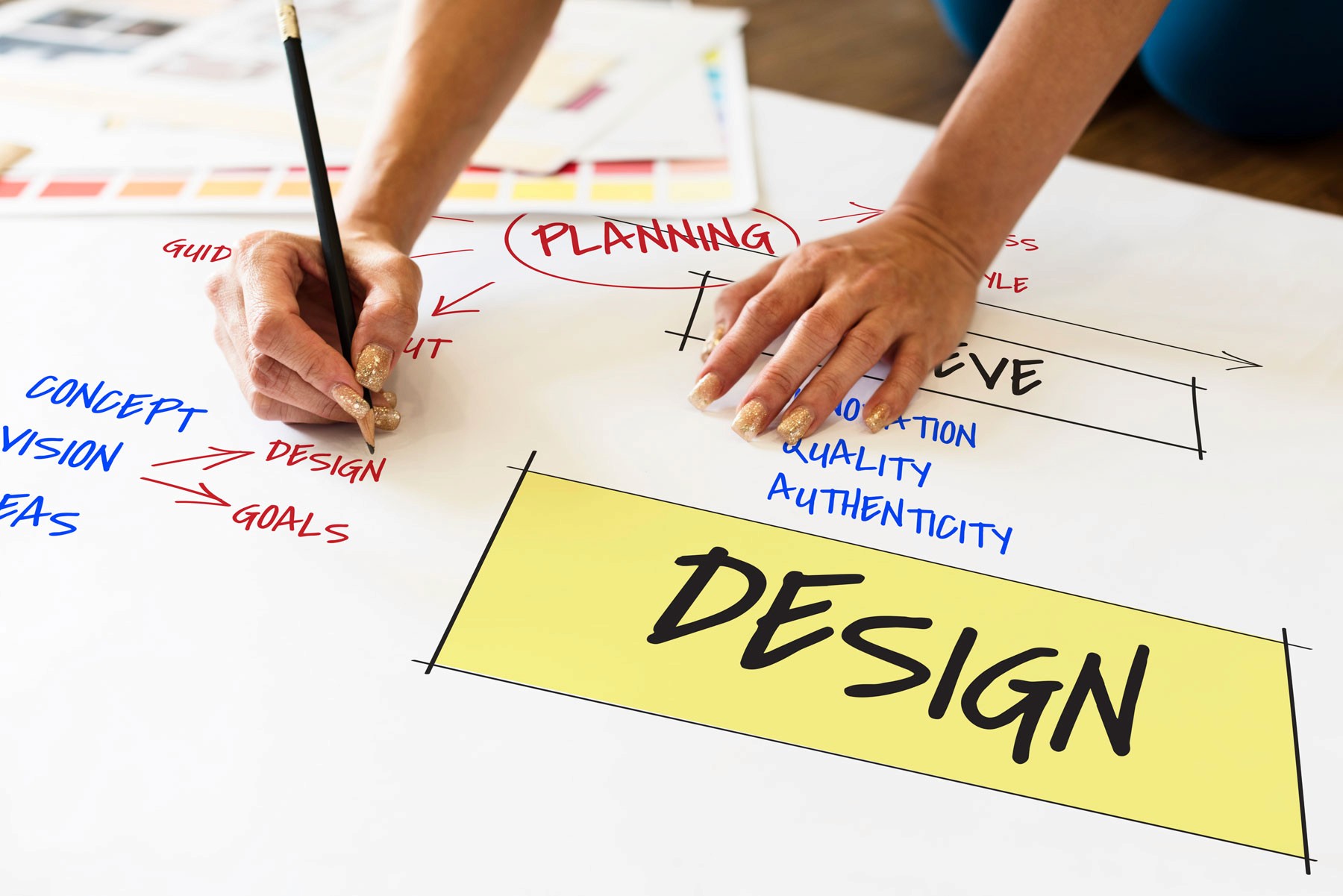
Your presentation, whether it’s a pitch deck, sales deck, or internal report, is more than a collection of slides. It’s a direct reflection of your brand. In 2025, audiences expect more than just information. They want experiences that are visually engaging, consistent with your brand, and strategically designed to hold attention.
Keeping up with presentation design trends isn’t about being flashy or “trendy” for the sake of it. It’s about making sure your slides feel relevant, premium, and capable of building trust with every audience, whether that’s investors, clients, or internal teams.
The 6 presentation design trends to embrace in 2025
Below are the design directions leading brands are using to elevate their presentations this year. They’re not passing fads. These are visual and strategic approaches that help your message land with impact.
Trend | What It Is | Why It Works |
|---|---|---|
1. Bold minimalism | Clean layouts, big typography, and one clear idea per slide. | Keeps the focus on your message and makes every slide feel premium. |
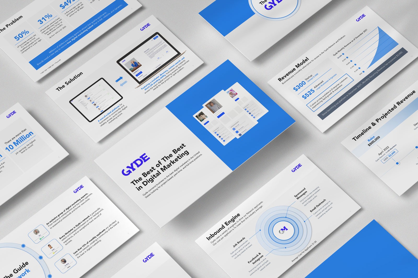
2. On-brand data storytelling | Charts, graphs, and icons designed in your brand style. | Makes data memorable and avoids the “default template” look. |
3. Dark mode & contrast | Dark backgrounds with bright accent colors. | Creates a sleek, modern look that pops on-screen. |
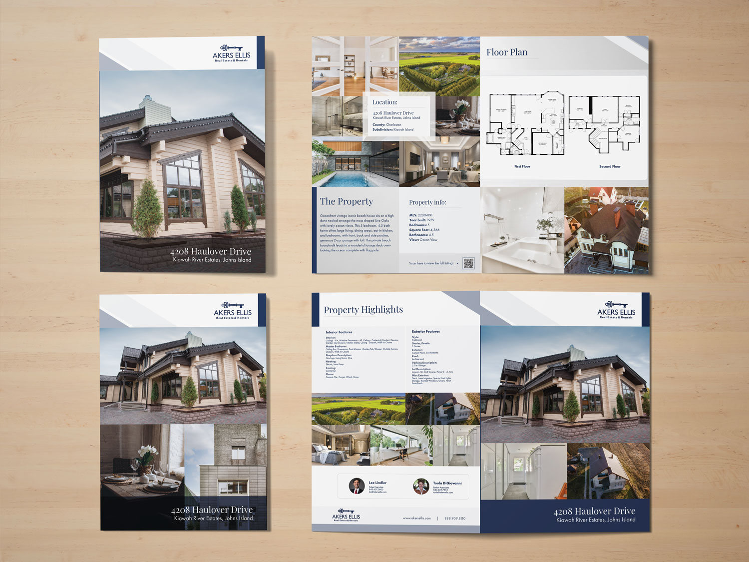
4. Custom visuals | Photography, illustration, or product imagery unique to your brand. | Builds authenticity and differentiates you from competitors. |
5. Cinematic openings | Full-screen imagery, bold headlines, and subtle motion to start. | Hooks your audience emotionally before diving into details. |
6. Luxury-inspired branding | Design cues from high-end retail, fashion, and tech. | Elevates perception, making your offer feel more valuable. |
1. Bold minimalism
In a world full of distractions, minimalism done right can be a game-changer. Bold minimalism strips away everything non-essential, focusing each slide on one main message. Large, confident typography paired with generous whitespace signals clarity and control. This style not only feels premium, it makes your content easier to process and remember.
2. On-brand data storytelling
Data is persuasive, but only when it’s easy to understand. In 2025, we’re seeing a push for data visuals that go beyond generic PowerPoint charts. Think branded color palettes, consistent iconography, and clear visual hierarchy. Your pitch deck or quarterly review should make data feel like part of your brand, not a break from it.
3. Dark mode & contrast
Dark backgrounds with strategic pops of bright color create a sleek, modern aesthetic that works especially well for digital presentations. This style not only looks sophisticated, it reduces eye strain in long sessions and makes key points stand out dramatically.
4. Custom visuals
Stock photos have their place, but they rarely convey the uniqueness of your brand. In 2025, high-end presentations lean on custom photography, product renders, and brand-specific illustrations. These visuals instantly differentiate your deck from the dozens of generic presentations your audience sees each month.
5. Cinematic openings
The first 60 seconds of your presentation determine whether your audience leans in or checks out. A cinematic opening with full-screen imagery, a bold statement, and subtle motion creates an emotional hook that makes people want to hear more. Think of it as your brand trailer.
6. Luxury-inspired branding
Borrowing visual cues from luxury industries such as refined typography, meticulous spacing, and rich textures can elevate the perceived value of your offer. Even if your product isn’t in the luxury space, these design elements signal professionalism, attention to detail, and quality.
Where AI fits in (and where it doesn’t)
Yes, AI tools can now help create slides faster. They’re useful for brainstorming layouts, generating quick drafts, or organizing ideas. But if you care about maintaining a consistent, high-end brand standard, AI alone isn’t enough. As it stands today, AI-generated slides often miss the subtle design decisions like spacing, hierarchy, and visual tone that make a presentation truly effective.
We’re not against AI. It’s a tool, but it’s not a replacement for professional design if your goal is to close deals, impress stakeholders, or elevate your brand.
Final thoughts
Trends come and go, but great design principles endure. The key is to apply trends in a way that serves your brand and your audience, not just because they’re “in.” When you combine high-quality design with strategic storytelling, your presentation becomes more than a set of slides. It becomes an experience your audience remembers.
Following design trends is not about chasing aesthetics, it’s about ensuring your presentations look and feel relevant, premium, and strategically built to persuade. The right trends, applied with intention, can help your brand stand out in the boardroom, on stage, or online. At Xiobo Creative, we design presentations that blend timeless clarity with fresh, modern appeal, so you look as good as your message sounds.
Make your next presentation your best one yet.
We design premium, branded presentations and pitch decks that turn heads and close deals.
Related services

More about
Presentation design