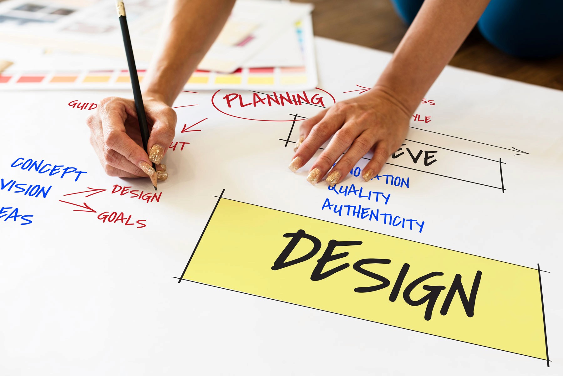
Why your presentation design matters more than you think


Most people underestimate how much design matters in a presentation
We’ve all seen them: bland corporate decks, plain monthly update slides, and product overviews that feel more like a wall of text than a story. And yet, those very slides are what companies use to introduce new features, secure partnerships, or present to investors. What most teams don’t realize is that their presentation design is silently shaping how audiences feel about their brand.
Whether you're building a pitch deck, marketing presentation, quarterly business review, or sales enablement deck, the design of your slides is doing one of two things: building trust — or quietly eroding it.
It’s not “just slides.” It’s a first impression.
Design communicates far more than words. In fact, people make snap judgments about your brand in seconds — and when your slides look generic, misaligned, or messy, your audience assumes your company might be the same. Clean, intentional design doesn’t just make your deck look better — it makes you look more credible.
Studies show that 75% of people judge a company’s credibility based on its visual design. And that applies just as much to a pitch deck as it does to your website or logo.
Think about the brands you trust
Why do companies like Apple, Figma, Notion, and Stripe feel so polished and professional? Because everything — from the packaging to their presentations — follows a clear, elevated design system. The moment you see one of their slides or videos, you sense the quality. It's subtle, but powerful.
That premium feeling isn’t accidental. It’s the result of intentional, high-end brand design that carries across every touchpoint — including slides.
What poor presentation design says about your brand
If you’ve ever watched a company’s YouTube product update or internal All-Hands presentation and thought, “Wow, this looks… off,” you’re not alone. We’ve seen too many great companies put out monthly features or launch updates with slides that look like they were thrown together last minute. No brand colors, no hierarchy, no story.
And when the design feels low-effort, the message does too. Even if the content is solid, people tune out. Or worse — they question the professionalism of the team behind it.
Bad presentation habits we see often:
Using default templates with no brand identity
Inconsistent fonts, colors, or spacing
Slides that are too text-heavy and hard to follow
Overuse of bullet points without visual hierarchy
No real story — just a collection of slides
These issues might seem small, but they create an experience that feels fragmented or amateur. And in a world where your audience is already distracted, that’s a risk you can’t afford.
Great design builds trust — even subconsciously
We like high-end brands. Even if we can’t explain why, we’re drawn to quality. The unboxing of a MacBook. The thoughtful animations in a Figma demo. The elegant spacing in a slide. It’s not just aesthetics — it’s how our brains register professionalism.
This applies to pitch decks, keynote presentations, internal reports, webinars, and more. When your deck looks elevated, you don’t need to say you're credible — the design does it for you.
Consider this:
When you buy a generic PC, it might come in cheap packaging with foam inserts and clunky setup instructions. When you open an iPhone, the packaging is minimal, sleek, and pristine. That experience — that feeling of quality — sets the tone for how you perceive the brand.
The same thing happens in a presentation. Clean layouts, smart visuals, and clear flow make your message feel premium. Poor design, on the other hand, adds friction — and doubt.
Design helps people remember your message
Good presentation design isn’t just about looks — it’s about making your message easier to follow and remember. Clear hierarchy, clean data visualization, and well-placed visuals help people absorb complex ideas faster. That’s especially important when you’re:
Presenting a pitch deck to investors
Training a sales team on a new product
Running a webinar with dozens of attendees
Pitching a client or partner on a strategic idea
Tools don’t matter — execution does
We get this question all the time: “Can you build our presentation in PowerPoint? What about Google Slides or Canva?” The answer is yes — and here’s the truth:
It’s not about the tool. It’s about the craft.
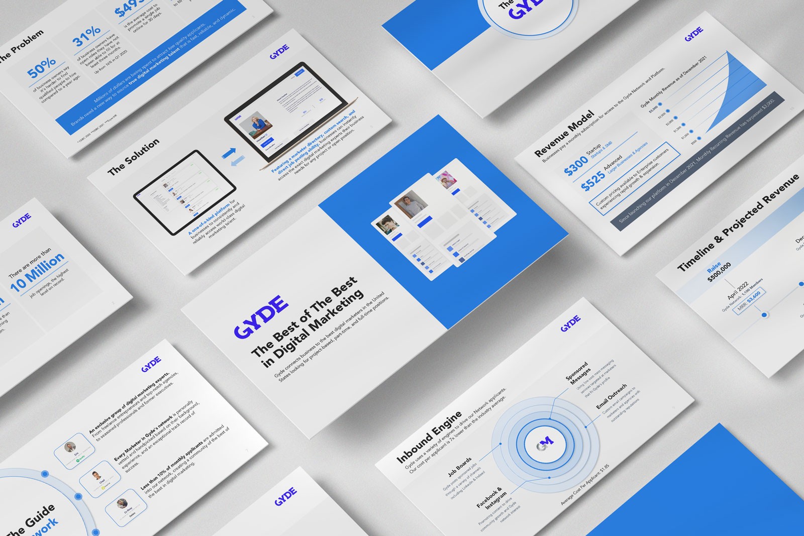
At Xiobo Creative, we design and build professional presentations in:
PowerPoint — Still the go-to for many corporate teams
Keynote — Ideal for Apple-based workflows and smooth transitions
Google Slides — Great for collaboration and sharing
Canva — Perfect for teams that want beautiful results with simple edits
Regardless of the platform, what matters is that the presentation feels intentional, brand-aligned, and persuasive. That’s where we come in.
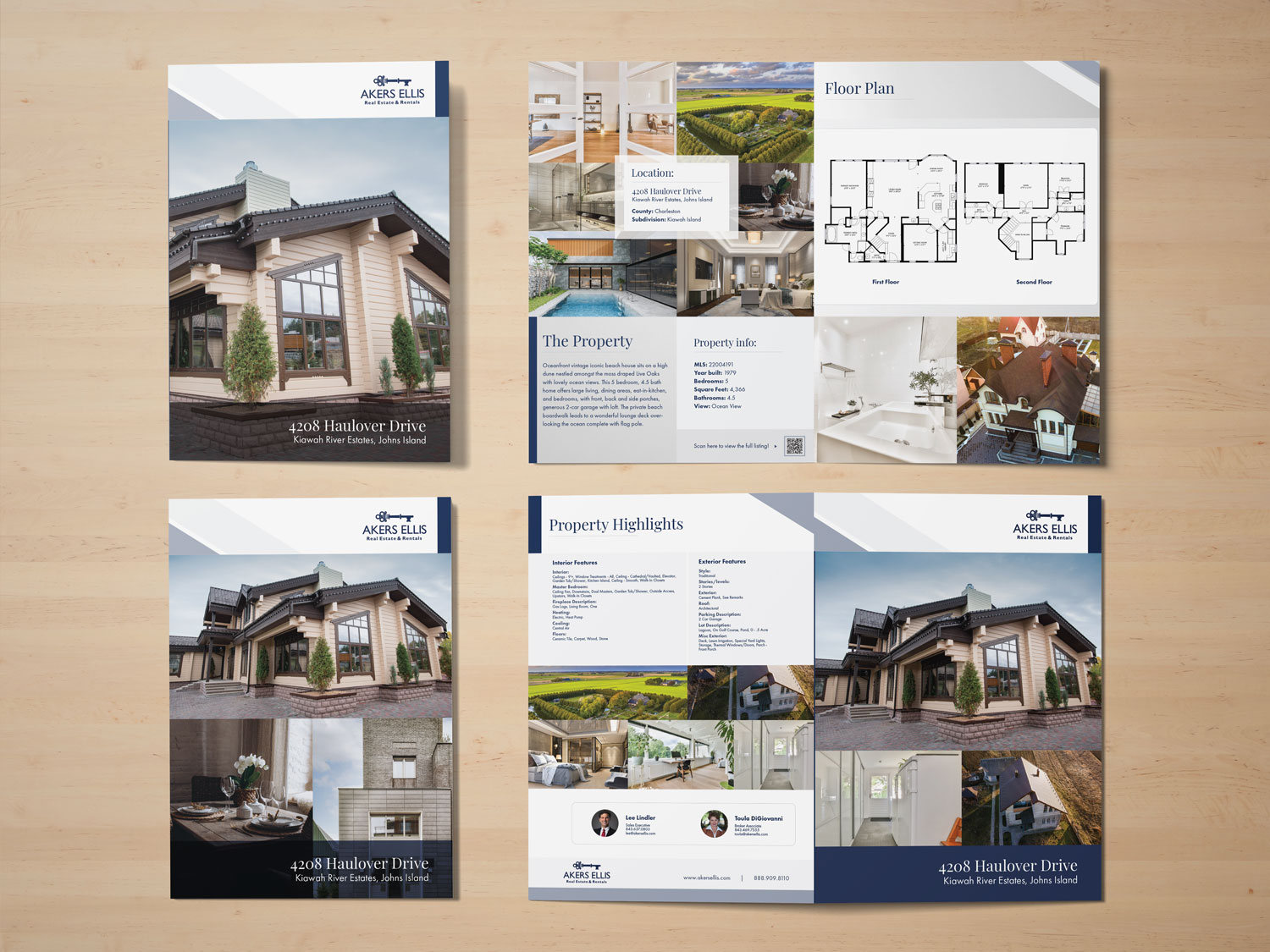
What companies get wrong about branded decks
A lot of teams assume a basic template with their logo and color palette is enough. But strong branding goes deeper than just matching colors.
Great decks should reflect the tone, confidence, and clarity of your brand — in every detail:
Slide titles that reinforce brand voice
Visual storytelling that reflects your product or service
Data visualizations that align with your messaging
Call-to-action slides that feel bold, not basic
It’s not about showing off design skills. It’s about reinforcing the value of your business with every click of the remote.
If McDonald’s still advertises, you should still design
Everyone knows who McDonald’s is — but they still spend hundreds of millions every year in advertising and marketing. Why? Because branding isn’t a one-time thing. It’s a long-term game. And consistency matters.
So even if your team thinks, “This is just a quick internal update,” or “People already know our brand,” remember: every slide you show is part of the brand experience. Don’t let that experience fall flat.
Strong presentation design = stronger results
At the end of the day, presentation design is a multiplier. It takes your ideas and makes them easier to believe. Easier to share. Easier to act on.
Whether you’re preparing a high-stakes pitch, delivering a thought leadership webinar, or just updating your internal teams — presentation design matters. Because people don’t just listen to your words. They see your brand.
A deck that looks thrown together won’t just be ignored — it could cost you the deal. Whether you’re pitching to investors, presenting to your board, or launching a new product, the design of your slides communicates more than you think. And when done right, it creates an instant sense of trust and polish that few competitors can match. Xiobo Creative helps you get there, no matter what tool you’re using.
Your next presentation deserves better slides.
Let’s turn your ideas into a branded, professional presentation that actually gets results.
Tags:
Related services

More about
Presentation design