How to design an investor pitch deck that actually gets results


Why your pitch deck design matters more than you think
In the high-stakes world of fundraising, your pitch deck isn’t just a slide show, it’s your business case, first impression, and storytelling tool rolled into one. Yet far too many decks fail not because of a weak business idea, but because the visuals lack strategy. They overwhelm instead of persuade. They tell, but don’t show. They clutter, confuse, and distract from the one thing that matters: trust.
Investors see hundreds of decks a year. They can spot poor design, messy layouts, or unclear messaging from a mile away. And they don’t have time to figure it out. If your visuals make them pause, doubt, or mentally check out, the deal’s already slipping away.
Whether you’re raising a seed round or preparing for Series B, your investor pitch deck needs to look as confident as the numbers you’re showing. And that means approaching design like it’s part of your business strategy, because it is.
Before you open PowerPoint: Start with the story
The biggest mistake most founders make is opening Keynote, PowerPoint, or Canva and jumping straight into slides. But a good pitch doesn’t start in a slide tool, it starts on paper. Or in a doc. Or on a whiteboard. The visuals come last. First, you need a strategy.
Think like your investor
Ask yourself: What does this person need to believe in order to invest in this business? What makes them skeptical? What do they look for first, traction, team, or TAM?
Designing a great deck starts with understanding what’s at stake for them. Investors don’t just buy ideas — they buy clarity, confidence, and upside. Your visuals need to reflect all three.
Outline your narrative arc
Every strong pitch has a throughline, a clear story that carries the investor from problem to solution to opportunity. The mistake most founders make? Turning the deck into a bullet-pointed dump of everything they want to say.
Instead, outline your narrative first. It could look like:
The problem — big, urgent, real
The solution — what you’re building and why it matters
The traction — early wins, validation, proof
The opportunity — TAM, trends, timing
The business model — how this becomes sustainable
The team — why you’re the ones to build this
The ask — clear and specific
Once that’s outlined, then, and only then, it’s time to design.
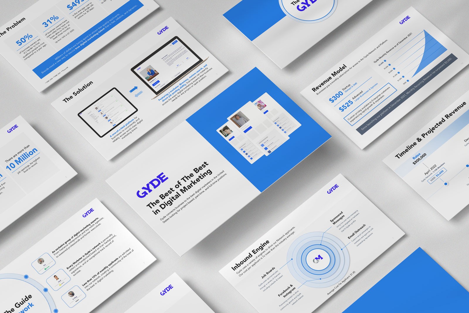
Design tips that build confidence not confusion
Your pitch deck design should do one thing above all else: amplify clarity. Here’s how to make that happen slide by slide.
Use hierarchy, not clutter
Too much text on a slide kills attention. Every slide should have one clear focal point. That might be a headline, a data point, or a visual. Use space intentionally. Give breathing room. If a slide has more than one message, split it.
Make your data visual and valuable
A chart is only as useful as the insight it provides. Instead of cramming raw numbers into tables, turn them into simple, elegant visuals that tell a story:
Line graphs that show traction over time
Bar charts that show growth or market size
Icons or visual markers that reinforce KPIs
And always ask: What does this slide make the investor believe? If it’s not clear, redesign it.
Keep visuals consistent
If your fonts, colors, icons, and layouts change from slide to slide, it sends the wrong signal: disorganized. A clean, consistent visual system makes you look sharp, prepared, and serious. Whether you’re using a template or custom design, consistency wins trust.
Design the “Why now” slide
One of the most underrated slides in any deck is the “Why now?” moment. Trends, timing, and urgency matter. Visualize momentum. Show the market shift. Use bold design to highlight what’s at stake — and why your company is the one to act on it.
Design for funding stage and context
Not every pitch deck is the same and it shouldn’t be. Tailor your design and content to your current stage:
Seed round decks
These decks rely heavily on vision, storytelling, and founder passion. Design should feel bold and simple. Use emotional language, relatable visuals, and a strong mission slide. You're selling belief.
Series A decks
Investors want more traction and operational clarity. Your deck should now highlight metrics, business model visuals, and milestones. Think clean charts, sharp execution plans, and competitive positioning.
Series B and beyond
At this point, the stakes are higher. Design needs to elevate maturity. Focus on scale, product expansion, org charts, and strategic roadmaps. Visual storytelling matters here more than ever — no one wants to see a Series B deck that looks like a school project.
Common design mistakes to avoid
Avoid these pitfalls that instantly weaken your pitch:
Wall of text slides — no one reads them
Low-res logos, charts, or images — feels amateur
Slides that duplicate info without purpose
Generic templates with no branding
Inconsistent slide titles or formatting
These may seem small, but they chip away at credibility, and in fundraising, perception is everything.
Practice the delivery not just the deck
The best design in the world won’t save a weak delivery. Founders often rehearse what they want to say, but not how they’re going to say it. But tone, pace, body language, and confidence can make or break your pitch.
Our advice: rehearse with someone who knows storytelling. If you’re working with a creative partner like Xiobo Creative, don’t just get design, get feedback on how the visuals support your flow. We’ve helped dozens of founders polish both the deck and delivery.
Your deck is your credibility. Invest in it.
When it comes to raising capital, you’re not just selling an idea, you’re selling your ability to lead, execute, and grow. And whether fair or not, much of that judgment happens in the first few minutes of a pitch.
Your design should do more than “look good.” It should build trust, tell a story, and move your business forward. If you’re serious about your next round, treat your pitch deck like a strategic asset — not an afterthought.
Many startups have great ideas and even promising traction, but still struggle to get funded. More often than not, the missing piece is presentation: both the message and the visual story behind it. At Xiobo Creative, we help founders design pitch decks that don’t just look good, they get results. If you’re ready to build a deck that makes investors lean in instead of tune out, let’s talk.
Ready to design a pitch that closes deals?
We create persuasive, professionally-designed investor decks that build trust and convert.
Tags:
Related services

More about
Presentation design