Your brand guidelines have a new reader
PowerPoint, Canva, Figma, Adobe, ChatGPT and Claude now read your brand rules before they design anything. Here’s how to make your brand guide work for them.
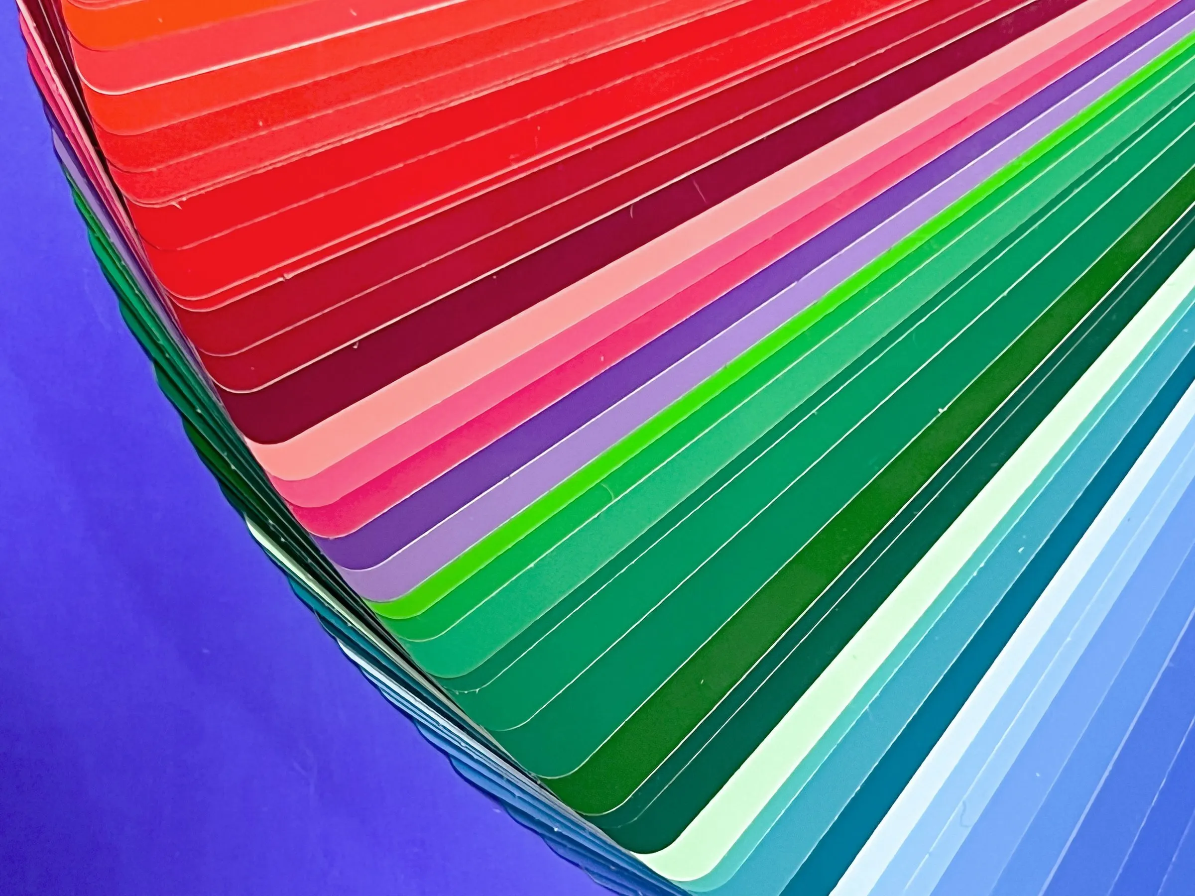
Last week someone on Hacker News posted a list called “Tells of a Slop UI”: the giveaways that a website or app was made by AI with nobody steering. It picked up 382 points and 243 comments in a few days. You already know the list, even if you’ve never seen it. Purple gradients. Frosted glass cards. The same sans serif everywhere. Little emoji icons. Headlines that want to “Elevate” something “Seamlessly.”
Here’s the same slide made twice: once by an AI tool with nothing to follow, and once with the brand system we designed for Quantro, our concept brand for a finance platform. Same message, same three points.
Before: the AI with no system to follow.
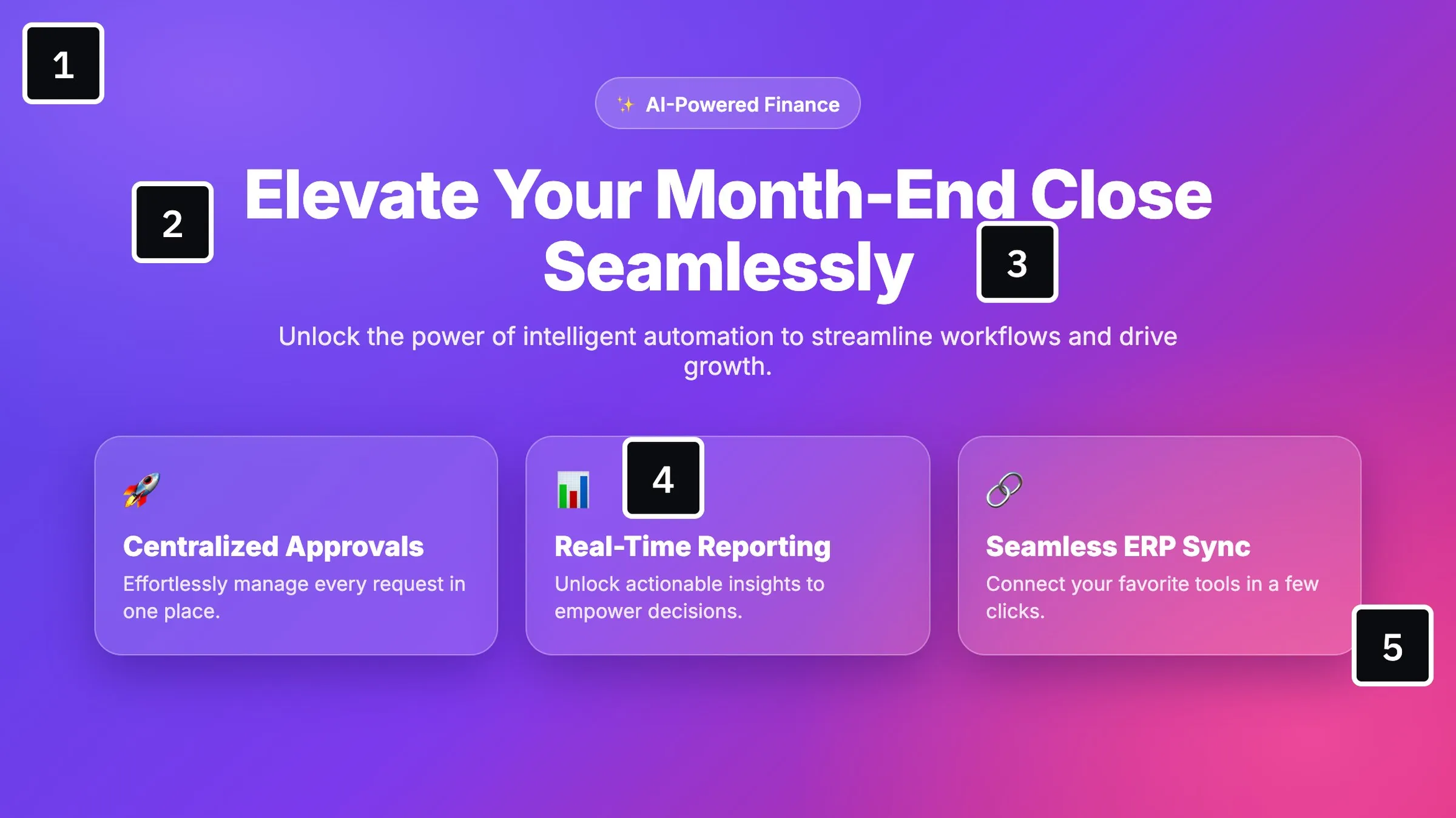
- A default gradient no brand ever chose.
- The same sans serif as every AI-made page.
- Hype words: elevate, seamless, unlock.
- Emoji standing in for icons.
- Frosted glass cards and Title Case Everywhere.
After: the same content, with the Quantro system loaded.
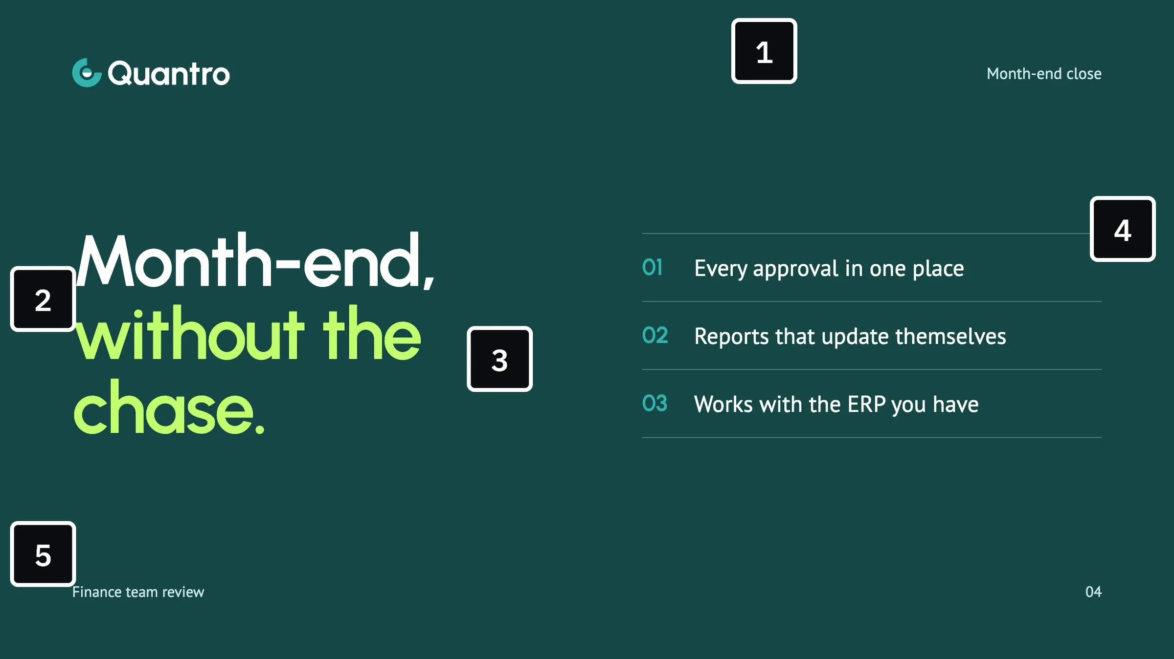
- Brand colors only, with lime saved for one highlight.
- Urbanist for the headline, PT Sans for the text.
- Voice rules: plain words, sentence case, no hype.
- A layout rule: three numbered points, never more.
- Logo, margins and footer straight from the slide master.
Every difference on the right comes from a written rule. Both slides are our own illustrations.
The interesting part of that thread wasn’t the list. It was how many commenters said some version of the same thing: most of those tells disappear the moment you give the tool a palette, a design system and a few written rules. The AI look isn’t really the AI’s look. It’s what you get when nobody gave it anything else. Defaults are the new clip art.
Everything looks the same, and people notice
In June, Creative Bloq ran a piece called “Everything looks the same. Now what?”, describing AI as an averaging engine: feed it the whole internet and it gives you back the middle. Software sites in the same navy and electric blue. The same dashboard screenshot in every hero.
Audiences can feel it. In a study The Harris Poll ran with the 4As and Infillion for Cannes this year, 73% of people said they’d trust an ad less if they suspected AI made it, and 78% said AI makes ads feel less authentic. That was about consumer ads, but I don’t think a B2B buyer looking at your sales deck is any more forgiving. If it looks like everyone else’s deck, it says everyone else’s message.
I’ve been designing brands and presentations for 20 years, and the sameness problem isn’t new. Stock templates did it. Big tech design systems did it. What’s new is the speed. A sales team can now produce fifty decks in an afternoon, and if the brand isn’t built into the tool, you get fifty slightly different versions of nobody.
What changed this fall: the tools started asking for your brand
The good news is that the software companies saw this coming. Over the last few months, almost every tool your team uses has added a place to load your brand, and some of them now enforce it.
- Microsoft PowerPoint. Copilot now has Brand Kits: logos, colors, fonts, templates, image rules and voice in one place, managed by designated brand managers. Since August, a company’s brand managers can turn on strict brand adherence, which means Copilot can only use your template’s layouts. You can also write rules in the speaker notes of your template slides, and Copilot follows them. Written brand “skills” start rolling out this month.
- Canva. Canva’s AI reads the Brand Templates you add to your Brand Kit when it builds presentations and social designs, along with your colors, logos, fonts and a short brand voice.
- Adobe. Adobe Express can check a design against your brand and flag the off-brand logo, color or font. Firefly can train a custom model on a small set of your own images, so generated visuals match your style, and Adobe’s enterprise tools can read your guideline documents directly.
- Figma. Figma’s agent works from your team libraries and variables, and since June it accepts custom skills: a text file with your team’s rules.
- ChatGPT and Claude. Both let you load brand files into a project and package rules as reusable skills. Claude Design goes further: it takes your design system, from a Figma file, a PowerPoint or a PDF, and checks its own output against it.
- Google Slides. For now, the main way to steer Gemini toward your brand is to attach an existing deck as a style reference.
That’s a big shift. For 20 years, a brand guide had one kind of reader: a person. A designer, a marketer, a sales rep trying to make a one-pager on a Friday. Now it has a second reader, and this one reads every single rule, literally, every time.
What each tool can actually read
Here’s where things stand as of October 1, 2026. These tools change every month, so treat this as a snapshot.
| Tool | What it can read | What we prepare for it |
|---|---|---|
| MicrosoftCopilot in PowerPoint | Brand Kit: logos, colors, fonts, templates, image rules, voiceOne guidelines PDFRules in a template’s speaker notesBrand skills in Markdown (rolling out in October) | A template built entirely on the slide master, with sample slides for every slide typeNotes on each sample slideA clean, text-based guidelines PDF |
| CanvaCanva AI | Brand Kit: logos, colors, fonts, a brand voice of up to 500 charactersBrand Templates for presentations and social | Templates written for AI, with clear placeholder text and locked elementsFont files licensed for embeddingA short voice statement |
| AdobeExpress, Firefly and enterprise tools | Brands in Express, with Brand check (beta)Custom models trained on your own imagesGuideline documents (enterprise) | A small, consistent image set for trainingLogo, color and type rules written as checkable rules |
| FigmaFigma agent and Make | Team libraries, variables and tokensCustom skills as a Markdown file | Colors and type as named variables in a published libraryA guidelines file in plain text |
| OpenAI and AnthropicChatGPT and Claude | Project files and instructionsSkillsClaude Design: your design system from Figma, PowerPoint or PDF | A brand skill in MarkdownLogos, fonts and a reference deck |
| GoogleGemini in Slides | An existing deck attached as a style reference | One clean reference deck that shows the system at its best |
Notice what keeps showing up in the right-hand column. A properly built template. Colors with names and hex values. Fonts you’re actually allowed to use in the cloud. Rules written down in plain words. None of it is exotic. It’s the stuff good brand systems always should have had, and often didn’t.
Most brand guides were written for people
Open a typical brand guide and look at it the way an AI tool would. The colors are in a nice spread, but sometimes only as an image. The rules are implied by the examples: you’re supposed to just see that headlines never sit on photos. The voice section is a mood board. The PowerPoint template is a file someone made in 2019, with the logo pasted on every slide by hand instead of living in the master.
A person can work with that. A person fills the gaps with judgment. A machine fills the gaps with the average of the internet, which is exactly how you end up with the purple gradient.
Anyone who has built a corporate PowerPoint template knows the difference between a template that looks right and a template that’s built right. The first one has the logo, the colors and the fonts in place. The second one has them in the master, the theme and the layouts, with a layout for every kind of slide the company actually makes. Microsoft now says it plainly in its own guidance: Copilot learns from your sample slides and theme definitions, not from one-off formatting.
Here’s my honest take: AI can make a really good deck. Not a passable one, a good one. But only if the system it works from is good, and only if it’s built in an order the machine can follow.
Build it in this order
This is the order we build a brand system in now, so that people and AI tools can both use it.
- The system first, as tokens. Colors as hex values with roles (background, text, primary, highlight) and how much of each. A type scale with real sizes and weights. Spacing and margins as fixed steps, not “whatever looks right.” If a value isn’t named, a machine will invent one.
- Fonts you can actually use in the cloud. Cloud tools need fonts they’re allowed to embed or upload, and some only accept certain file types. A typeface that only lives on your designer’s computer won’t survive the trip into Copilot or Canva. License the right version, or pick a fallback on purpose.
- The assets. A logo set in SVG and PNG, for light and dark backgrounds, with clear-space rules written in words. An image library with descriptive names and tags, because AI image search runs on that information. “IMG_4471.jpg” is invisible.
- The layouts. A PowerPoint template built entirely on the slide master, with a layout for every slide type your team makes and sample slides for each one at different amounts of content, from a single statement to a dense two-column slide. That’s what the tools learn from.
- The rules, written down. In the speaker notes of the template slides (“Never more than three points on this layout”), in a 500-character voice statement for Canva, and in a plain-text brand file. Microsoft, Figma, OpenAI and Anthropic now all read the same simple Markdown “skill” format, so one good file can steer four ecosystems.
- The tests. More on this below, because it’s the step almost everyone skips.
Here’s a shortened version of that brand file for Quantro:
---
name: quantro-brand
description: Visual and verbal rules for anything made for Quantro.
---

# Quantro brand rules

## Color
- Deep green #144745: title slide backgrounds.
- Teal #138D93: section dividers and the highlighted data point.
- Pale mint #EBF8F7: content slide backgrounds.
- Lime #C2FF6E: one highlight per dark slide. Never on light backgrounds.
- Ink #0A0D12: all text on light backgrounds.

## Type
- Headlines: Urbanist SemiBold, sentence case.
- Body: PT Sans Regular. No all caps, no exclamation marks.

## Layout
- Margins of 6% of the slide width on every side. Logo top left, slide number bottom right.
- One idea per slide. Numbered points, never more than three.

## Voice
- Plain and specific. Talk about the finance team’s week, not “transformation.”
- Never use: elevate, seamless, unlock, empower, revolutionize.
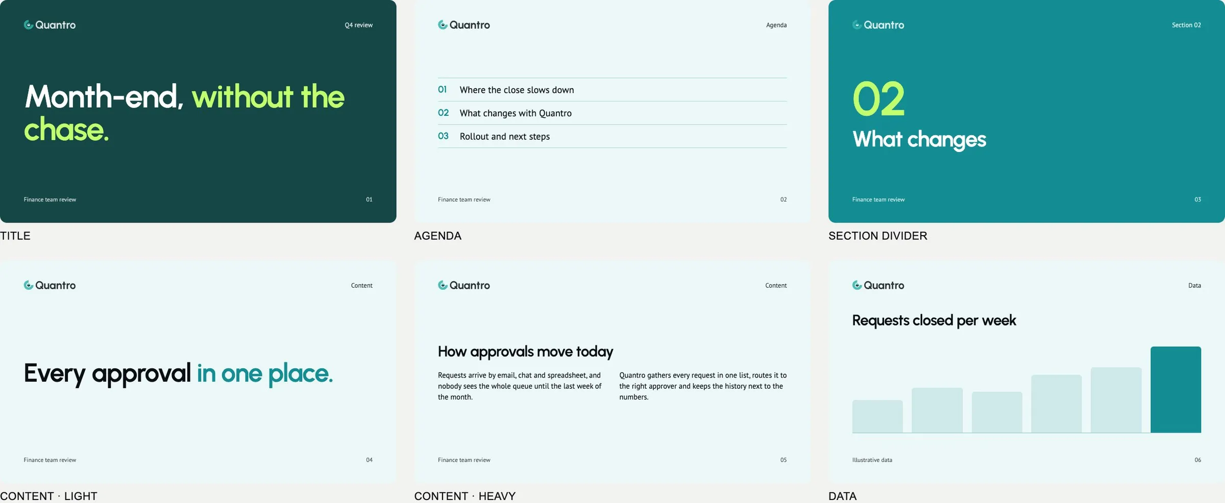
A small slice of the Quantro template: a sample slide for each slide type, from a single statement to a dense two-column slide. This is the kind of system the AI tools now learn from.
Then test it, so it can’t drift
A brand guide tells the AI what to do. A test checks that it did it. That second part is what turns “mostly on-brand” into “always on-brand.”
The tools are already moving this way. PowerPoint’s strict brand adherence won’t let Copilot step outside your layouts. Canva lets you lock elements in a template. Adobe Express flags off-brand logos, colors and fonts. Claude Design checks its own output against your design system before it shows you anything. The direction is clear: brand rules are going from suggestions to checks.
You can go further on your own. If the rules are precise, most of them can be tested automatically. Every color on the slide is one of the five in the system. Every font is Urbanist or PT Sans. Margins sit on the grid. No slide has more than three points. No headline uses a word from the banned list. A designer can’t check that on a hundred slides by eye. A script can, every time.
We do this on our own work. The site you’re reading runs a check before every release: any color, size or style that doesn’t come from our design system gets flagged, and it doesn’t go live until it’s fixed. It’s why the site still looks like one site after months of changes. We take it further in the Mac and iPhone apps we build: every screen is compared with its design file, and if a margin drifts or a control goes missing, the build fails. The same idea works for a sales team’s decks.
The design work moved upstream
So no, I don’t think AI is the enemy of good brand work. Set up properly, it will follow a system more consistently than a busy sales team ever did. What changed is where the design happens. It used to happen on every slide. Now it happens in the system: the tokens, the layouts, the rules and the tests that everything else is made from.
That’s still a designer’s job, and honestly it’s the more interesting one.
If your brand guide was written for people only, it’s worth a fresh look. We build brand identities and presentation templates that are ready for the tools your team already uses, and we can audit the system you have. Tell us about your brand.