Choosing the right color palette for your brand
Why your brand's color palette matters, plus a practical way to choose one using your audience, color psychology, competitor research and a mood board.

Choosing the right color palette is one of the most important steps in building a strong, memorable brand. Colors carry emotion, signal meaning and stay in people’s memory long after the details have faded.
This article covers why your palette matters, how to choose one, and how we approach color in our own brand identity work.
Why your brand’s color palette matters
Your palette isn’t just an aesthetic choice. It’s a strategic decision that shapes how people perceive your business. Here’s why.
1. Instant recognition
Used consistently, color makes a brand recognizable at a glance. When people see your signature colors, they should think of your products or services before they read your name.
2. Emotional connection
Colors evoke feelings. Warm colors like red and orange tend to feel energetic, while cool colors like blue and green often read as calm and trustworthy. The right palette helps you set the emotional tone you want.
3. Differentiation
In a competitive market, you need to stand out. A distinctive, well-considered palette helps separate you from competitors, especially in industries where everyone defaults to the same shade of blue.
4. Cohesiveness
A consistent palette ties together everything your brand produces: logo, website, marketing collateral, presentations and products. That cohesion reinforces your identity every time someone sees your work.
How to choose the right color palette
Choosing a palette means weighing your brand’s personality, your audience and the feelings you want to create. These steps will guide you.
1. Understand your brand
Define your brand’s personality and values. Are you energetic and playful, or serious and precise? That personality should guide your color choices.
2. Know your audience
Think about who you’re speaking to. Different audiences and markets can read the same color differently, so make sure your choices resonate with the people you want to reach.
3. Use color psychology with care
Learn the associations different colors carry. Yellow is often linked with optimism, and purple with sophistication. These associations aren’t universal, though. They vary by culture and context, so treat them as a starting point, not a rule.
4. Study your competitors
Look at the palettes your competitors use. Colors that are too close to theirs can cause confusion, while a clear difference helps you own a space in people’s minds.
5. Create a mood board
Collect images, color swatches and design examples that inspire you. Seeing them side by side helps you picture how a palette might come together. Palette generators such as Coolors, shown below, make it quick to try and compare combinations.
6. Build out the full palette
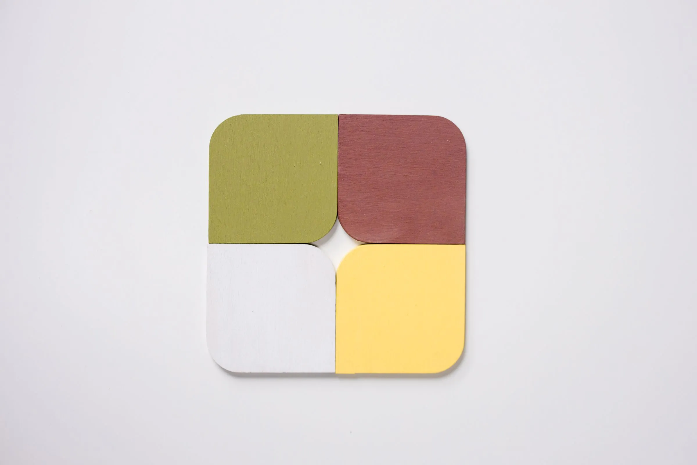
A brand palette is more than one favorite color. Most brands need a primary color, one or two secondary colors, a set of neutrals for text and backgrounds, and an accent for calls to action. Check color contrast for accessibility early, so text stays readable on every background, and define each color for screen (HEX and RGB) and for print (CMYK, plus Pantone where you need exact matches).
7. Test it on real work
Before you commit, try the palette on real pieces: a business card, a slide, a social post and a web page. Colors that look balanced as swatches can feel very different at full size or on a phone screen, and some shades shift noticeably between screen and print.
How we approach brand color
Color is one part of our brand identity work. Here’s how we handle it.
1. Brand consultation
We start by working with you to understand your brand’s values, goals and audience.
2. Color psychology in context
We weigh the associations each color carries against your market and your competitors, so the palette sends the right message.
3. Custom color palettes
We build a palette that’s distinct to your brand and works across every format you use, on screen and in print.
4. Consistency in use
We document the palette in brand guidelines with real examples and apply it to the templates your team uses every day, so the colors stay consistent long after launch.
For Quantro, one of our concept brands, we paired a deep teal with a pale sage to give a financial software product a calm, credible feel, then carried those colors from the logo to business cards, signage and the website.
Final thoughts
Your color palette is one of the most visible decisions you’ll make for your brand. Chosen with care, it expresses your personality, supports your message and makes you recognizable at every touchpoint. It’s also one of the hardest things to change once it’s everywhere, so it’s worth getting right from the start. If you’re building or refreshing a brand, tell us about it.